Friday, May 11, 2012

The Influence of Colours

There are a variety of colours we see everyday, colours influence us unconsciously to do different things. Brands use this as an advantage to use colours to influence different behaviours upon their company. As I noticed that different logos have different colours, I then learned about how the colours change my perception of a company, and how I'm unconsciously attracted to them.

I learned about the main colours found in the rainbow and how each colour influences us differently.

Red is the colour of passion, action, adventure, rebellious, etc.. 

   Virgin Mobile uses red to show adventure and being rebellious. 

Blue represents security, trust, productivity, calming, etc..
a lot of logos have blue in them, in banks, insurance, etc.. (IBM, RBC, Allstate) these companies show security and trust, and influences us to trust this brand more than others.

Orange represents values, discounts, hunger, etc..

Green means freshness, revitalization, health, wellness, eco-friendly

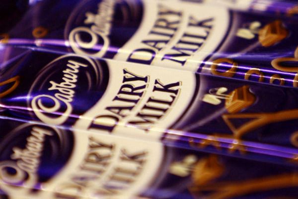
Purple represented royalty, nobility, luxury, etc..

Brown was honesty, dependability, earthy, etc..


Tuesday, May 8, 2012

Snake Heads Tattoo Artist Brand Summary

My graphics brand identity is called, "Snake Heads Tattoo Artist" and my business focuses on creating several unique tattoo design stencils and templates, and selling them to tattoo shops.

For my brand, I clearly show that I am a tattoo related business, with my main "logo" as a traditionally drawn snake. I confirm my credibility by having all the designs drawn by me, so all the designs have a similar look furthering the process of defining my brand.By creating traditional designs my prospective clients will be more emotionally attached to my brand; tattoo artists aim for traditional more than the new tattoo designs.

My target audience will be mainly tattoo shops and freelance tattooers (successful and developing). This can mean anything from veteran tattooers to beginners, since tattoo artists need stencil outlines to create images my brand creates specific images to the clients needs. Stencils however are only needed once (being only used to trace making them reusable) meaning I have to sell variety of different designs to attract more clients. My target clients are faced more toward new beginners since they will need stencils to start up. Creating both customizable and traditional stencils clients can get what they want and also attracting them to make their own choice. This creates a client "loyalty" since I can provide any design they ask for so they wont have to look for anyone else for the specific image that they want. This keeps my business strong by being able to sell more than one product rather than one specific product that I can only sell once.

Each image (traditional or customised) have a similar style, defining and recognizing my brand to the image. My brand focuses on providing high quality stencil images for freelance beginners and veteran tattoo artists. Since stencils are usually made by different artists and each look different in style and overall appeal, usually made with cheap papers and inks to make the image hard to trace and differentiate between colour and shading. Never being unified because of the different styles making them unappealing. I want to create a "classy" and "royal " feel to the art of tattooing.I wanted to create a brand that has only one style of stencil art, and that each image drawn is specifically created to look like the perfect traditional tattoo outline with crisp clean lines with options of coloured, shaded, or plain outlines.

The variety of options and style of layout of the stencil is where the customizing comes into play. Clients can choose how the images are laid out, and what quality of paper and size, inks, and details are put into the images. This freedom to have choice gives clients the feeling of royalty and importance, this is what I aim for in my brand.

Currently their are no big successful Tattoo stencil companies, the companies that do sell stencils are each made from a different artist which doesn't compete against my unified goal of having a similar style in all my drawings. This is why my brand will attract customers, bringing a new style and devotion to tattooing.


Monday, February 13, 2012

My inspiration

There one artist out there that has the most creative mind I have ever seen. His name is Mark Ryden, an oil painter who has a "unique" art style to create different scenes with familiar characters he uses repeatedly (Abraham, repeated use of meat, etc.) His art inspires me because of the amount of detail he puts into his work, the subject matter is always drawn so confidently and clearly that the end result is just so eye appealing and beautiful. His use of putting "subliminal" imagery into his paintings makes me even more interested in his art.
Mark Ryden "Piano Player"

His unique style impresses and creeps out many art critiques.

Tuesday, February 7, 2012

Illustrator Pen Tool Review

This is my pen tool practice. I used images of seagulls to practice because of the complexity of the wings and the curves to really show off my skill and knowledge of the pen tool.


Friday, January 27, 2012

Eventscape

A couple weeks ago we took part in another Shazaam assignment. This time working with a company called Eventscape who work in making large architectural sculptures and buildings. Our assignment- to create a visually appealing, cost effective, simplistic sculpture for our school. This project took us weeks to complete until we came to a final product. These are the steps we took into making out final design.

First we thought of possible locations to put the sculpture (areas with nothing in them or have no visual interest) in the end we all chose site C (west of the parking lot) and decided to design models that would fit all the criteria to meet site C's needs (picnicking area, trees, next to field, next to sidewalk, etc).

Then we designed models individually. Everyone came up with their own unique idea, and we repeatedly came up with new designs daily. Some of our models we had to rip apart to see if we can change or have new inspirational thoughts of how the piece would look. Everyday we were given more and more restrictions to make us understand that we had to look at the realistic point of view and create a model that would fit our budget.

In the end we chose a ribbon like object that twisted and flowed. I however created my own final piece- the Explosive Chair!

My idea was to create a metallic base with long metal rods shooting out at the end (like an explosion) and on each rod would be "shards" of flat metal (these would act as the chairs) This piece met all the criteria to be a made piece, but the material was out of our budget unfortunately. I came up with this piece thinking of a chair that can have multiple seating areas, yet still be able to see people in all directions. I like this design out of all my designs because it is simplistic and modern. This piece gave me inspiration to create more different designs and sculptures!

Monday, September 26, 2011

Duality Portrait


First let me explain the assignment. We had to express our personality in 2 contrasting ways, but however, somehow unified- such as good and bad. Then we had to take our idea and express in an medium as long as it truly expressed your idea in the best way. ( such as being sad, you use water colour, to show droopy and messy lines, etc)

In my duality portrait I express my 2 personality traits of being unique, and being persuaded easily. I myself think I'm unique. Well I know everyones unique in their own way, but we all seem to follow the same rules, same "acceptable" traits that make us normal in society. I try not to be like society, what's the point of being everyone else? However, I'm easily persuaded, i want to be unique, however people around me influence to be like them, dress like them, act like them, just so I can fit in without being judged.

So I expressed these 2 traits with acrylic on canvas, with a really ugly looking man with society in the background. Don't get it? let me explain...

 Society is in the background, notice how they all look the same, only with minor differences (such as height and width) because everyone wants to be the same, or copy other people. This is what makes them gray and bland, because they don't try to be interesting, just accepted. I am the weird orange guy in the foreground, unique, different, stands out in many ways compared to society. However, being unique is being ugly, you are looked at differently with disgusted faces, people think you're weird, different, strange, etc.. Thats why the orange guy is ugly, because being different isn't good, its bad, and society tries to make you be like them, when they eye you down in disgust. Thats when my other personality trait comes in- being persuaded easily. The green tree on my head represents my brain, notice how branches of the tree are attached to people f society, since I am easily persuaded, I actually listen to society and try to be like them so I'm accepted, so I absorb information from them into my brain, so I can learn to be the same, and not unique. This where my 2 traits clash; I want to be unique, special, I want to stand out, however, I have the fear of being judged, so I want to be like society and everyone else at the same time.

Well that is my duality portrait, hope you like it! :)

Friday, September 16, 2011

Chuck Close

This is one of my favourite artists, a modern painter named Chuck Close creates large canvases of people faces in the most precise detail. This style is known as hyperrealism, an art style which resembles a high-resolution photo with extremely small brush strokes (or other media) Chuck Close's pieces are found in many art museums and galleries around the world.
"Big Self-Portrait"
1967-1968

This is my favourite piece by him, known as the "Big Self-Portrait" this is obviously a large image with Chuck on it. This is acrylic on canvas, and as you can tell its extremely detailed. This piece as been in a number of art galleries, such as the Target gallery and the San Francisco Museum of Modern Art. There are no visible brush strokes there is a wide range of shade. This piece is effective and visually appealing because its overwhelming to know that this piece is created by acrylic paint with extreme attention to detail.

That is why its my favourite piece- extreme attention to detail. I can't deny that paintings with large globs splattered everywhere isn't nice, but I'm more into detail. Chuck Close really expresses it through his paintings, Because some of his pieces take years to do, and to know he has the patience to do them all gives me inspiration. I'm never really patient when it comes to art, I usually rush things, but I'm trying to be patient, because the final product would be worth it in the end, Chuck Close proves that.

Here are some other paintings by Chuck Close


Friday, June 3, 2011

Snow White and the 7 Dwarfs

This Classic Disney movie was created in 1937, and this was awhile back ago. At that time they didnt have all the fancy computers and technology that we have today, and animation back then was a pain in the butt.  Snow White is a special movie because it is the first animated feature film in America, not only that but it was also the first cel-animated movie featured in FULL colour. This movie was also the first to be produced by Walt Disney himself, so this movie is more special than it seems.
At this time, Walt Disney wasnt the large amazing thing that little children screamed for, at that time it was small, and the animators were amateur newspaper comic artists. Ater lots of training they got to work of the animation of Snow White. Like i said before, technology wasn't the same as back then, the movie was created not by a computer program, however through a process called Rotoscoping. Rotoscoping is a animation technique where the artist traces over live-action film movement... frame by frame. Yeah thats right, every single movement was drawn frame by frame. Nowadays, computers pretty much do everything, with programs like Flash, even 6 year olds can do a simple animation. But yeah, since everything was done frame by frame, ALOT of animators were needed to create different scenes, draw backgrounds, colour, music, etc. etc... So obviously this movie took longer than animated movies nowadays would take. Here is a classic example of rotoscoping, by a very familiar classic cartoon character.
This film was released in 1933, 4 years before Snow White was released. And considering that Snow White is in full colour there was a large uproar of excitment to see cartoons in colour. After Snow White, many other Disney movies were in colour, slowly rasing the popularity and vale of Disney.

Snow White is currently known as one of the most classic Disney movies ever, and has one of the Disne princesses too.

Wednesday, May 25, 2011

Photography

Yesterday, our group went out to take pictures of different compositions. The cameras we used had shutter speeds and F apertures, so we needed to know how to change the ISO so the images would turn out. Underexposing an image would make it dark, this is because not enough light reached the film to create an image. Overexposing would make the image too bright, too much light would make the image white (the film was exposed too long, or the surroundings are too bright, such as a sunny day). By changing the shutter speeds and apertures correctly, the images can turn out beautifully, and understanding how to use the camera, you can use many helpful techniques to really make your images look professional (panning and blur)

Unfortunately, since this was our first day with the cameras, our images didn't turn out as we wanted them too. When we went out to shoot, we took pictures of the same object to test out what different f apertures and shutter speeds would create.

shutter speed: 1/200 F number 22
This image came out clear (no blur) however is slightly underexposed

shutter speed: 1/50 F number 18
Now the image is too bright, it was over exposed

shutter speed: 1/200 F number 22
Image is way underexposed

shutter speed: 1/50 F number 36
This image came out perfectly (in my opinion) it is slightly bright though

Edward Burtynsky

We watched a film about a photographer named Edward Burtynsky. This amazing photographer went around the world to highly industrialized cities to take pictures of manutfactured landscapes.

Burtynsky is focusing on this theme to show the people how our idea of landscapes is changing, from lush and dense forest greens, to repetitive and depressing smog of todays technology. He shows through his photos how the industries are affecting our environment in a beautiful way. The documentary showed us cities in China which had workers amoung workers doing repetitive tasks over and over to create products for us (clothing irons), while other areas of the world showed what happens to the products when they are thrown out.

This documentary was amazing in representing the current modern world of today, showing the pros and cons. Made us (the students) rethink our lives, and how lucky we are, because other places are suffering, either having to work in a boring job for years doing the same task over and over, or having to live in a city of garbage, where the smog is so dense you cant see very far in the fog.

Burtynsky had to endure these awful surroundings to take these photos for his gallery. I think that he is an amazing photographer because even the landscapes he visited were horrid and depressing, he made them look beautiful, he must be pretty awesome to make oil spills, and coal mines look beautiful.


Edward Burtynsky Highway #1, Los Angeles, California, USA 2003 © Edward Burtynsky Courtesy Nicholas Metivier Gallery & Hasted Hunt Kraeutler New York


Wednesday, April 20, 2011

CHAIR

Our assignment was to create a chair that expresses the form of art, exudes our personality, has balance, and is appealing to the eye and is "modern" to today's society.

My chair is sleek, thin, and simplistic, it is a form of art. The actual seat is in a form of an "s" which shows of curves and leads the eye. The base of the chair is curvy and compliments the chair itself. I designed the chair white, to show of the shape and texture more (having many colors and patterns distracts the eye from the shape of the chair). I designed the chair to be elegant and appealing.

This chair exudes my personality by being laid back and simple. I myself am very lazy, so a rocking chair represents laziness. Being sleek and simplistic is my preference when it comes to furniture. I like my furniture to be simple yet amazing and modern. My design ideas are futuristic, so I designed my chair to be futuristic. This chair really expresses what I feel mentally and physically; mentally by being simple, straight forward, and is attracted to modern simplicity. Physically, by being a symbol of laziness, and slim (not being arrogant) :)

This hair appeals to the public by the societies preference for modern simplistic furniture. This chair (which I designed) would come in the colors white and black. These colors are highly appealing to todays public. The colors go with everything, and gives it the modern feel.  


Wednesday, March 30, 2011

SketchUp

This is what 30 minuted of stress looks like. Sketchup is a really difficult and complicated program. Hopefully I'll be able to use it for assignments however.

Tuesday, March 29, 2011

Romanticism Collage

Romanticism was an artistic, literary and intellectual movement that originated in the second half of the 18th century in Europe, and gained strength in reaction to the Industrial Revolution. Our assignment was to express this form of art through collage or inking. I chose collage because collageing can have endless possiblilities and the ability to use materials freely and express them differently. Having a variety of colour and value is what I like to have when I'm expressing Romanticism. 
My idea I used to express Romanticism was the true story of a dog named Hachiko, "The dog who waited". This remarkable true story took place in 1923-1935, and a special breed of dog (Akita) waited for the return of his deceased owner for 10 years until Hachiko died.
To read more about this remarkable loyal dog, read this article: http://en.wikipedia.org/wiki/Hachik%C5%8D


I expressed this story through romanticism, collage. The focal point was on Hachiko, while being watched b y many people of different races. I used the Golden triangle to make the piece unified, and I am happy how the piece turned out. The part that makes the piece unified, is the text (cut out of a article) of little words that put meaning into the piece. Wordings such as, "Maybe someday" or, "Love endures". I aimed for my piece to be simplistic while having a powerful message. 

How Computer Graphics changed

Computer graphics started in the early 1970's. When computer graphics started, it was simple roumd and sharp shapes, like squares and circles made into cubes and spheres. The graphics were simple unrealistic, and there was very limited variety of colour used to show value. However considering it was the first graphics, it was pretty amazing for back then, on how technology was moving so fast, we alredy started to create virtuel worlds.

One of the popular old style grpahics, was in the 80's known as,"Tron". Tron was was a complete virtual world and majority of all of it was computer graphics. here is one of the most popular and memorable scenes.

Here is the new tron movie coming out

As you know, looking at these old style graphics, you realize how much  it has changed in just under 30 years. Looking at todays computer animations, which are so realistic and detailed, it is said to just take over human actors all together. just look at this trailer of a new movie coming out this year, so realistic. :)


Looking at this in the perspective of a person in the 80's their mind would be completly blown away. This proves that technology is speeding up so quikly now, and probably in 10 more years or so, I wouldn't be suprised if human actors were replaced completly by graphics.

Here are some samples of computer graphics how they chnaged over the years:


Friday, March 4, 2011

Good VS Bad Videos

This is my example of a bad video. The song itself is good, however the video has no meaning at all, and some of the "characters" are quite disturbing for general audiences. I think this video is a perspective of what its like under the influence of drugs, and there are bright colors that can cause epileptic side effects to some whom are common to get seizers. The "woman" or if they are woman, are wearing revealing clothing with suggestive gestures traced all through the video. This video is exactly like an acid trip, and I don't find it a good video at all.

The other video i chose was Linkin Park, "What I've done" the video didn't upload because blogger is weird. Well the video is my example of a good video, because the song has an amazing meaning, and the video itself communicates with the song together beautifully. The video gives you goosebumps.

http://www.youtube.com/watch?v=8sgycukafqQ

Comparing Canvases

In art class, we were to draw 3 pieces (a large pastel, a large painting, and a small painting) that was similar to a small cropping we did. The image was supposed to be like the small image cropping, but we were allowed to change contrast in value in our own way. The cropping was supposed to have a composition (mine was golden triangle). I chose my large painting and my small painting as my 2 favorite pieces. The large painting was supposed to be quick and the brush strokes were to be quick and full of expression, there wasn't meant to be much value, so the brush strokes had to be intereting. The small cnavas painting was meant to be very detailed, with layering and brush stroke textures. Many colours had to be used to show different values. For the large painting, I did use lots of colours but i experimented sing different colours from the original cropping. The large painting is more dark and the colours are more saturated, to exhibit the generals colours in the peice. The small canvas painting i did was more bright, and i used a variety of shaded, and was more careful in my brush strokes. 
This is the small canvas painting

This is the large painting

Friday, February 25, 2011

I chose to use Toy Story 3 as my trailer, because I love Toy Story, and Disney movies are usually innocent and always have a happy ending. I changed the movie by turning it into a action thriller like Bourne Identity. The movie is originally about Andy graduating and going to college and his childhood toys have to go find a new place to be wanted. In my edited version, the main character is Woody, and he has to get through a rigorous life threatening journey, etc etc.. I changed the movie into an action thriller, I used the original trailer and some scenes from the movie, i used the song, White washed by August Burns Red as the background music, and i used Imovie sound effects as well.

Thursday, February 24, 2011

Friday, February 4, 2011

Hey

Hi, my name is Blaire. I love to draw and do art things, so that is why i joined Cyberarts. In my spare time i like to hangout with friends and do pointless non-accomplishing things. I love drawing and do it not only during school time, but all the time. Considering that I am distracted constantly and my pills have no apparent effect, i like to distract myself by drawing. I like to draw a variety of subjects, from artistic works which i pursue in close precise detail (to add to my portfolio) to pointless doodles which have no meaning, and in the end, recycle them, so they can be turned to paper once more, for me to draw on. I like being sarcastic because being serious is boring. I like to socialize with everyone, I can be very awkward at times, but sometimes i am very chill, and not do weird things. I love dogs, i have 2 dogs at home, not like anyone cares, but i chose to write this so my autobiography looks long and thoughtful. I care about school, but i have a habit to procrastinate, to the point of not completing/accomplishing anything. My new years resolution was to actually give a crap and try my best in all my classes, including Cyberarts. I am really looking forward to this year, and hopefully i do not fail badly, because my indian mom will get mad at me. thank you for taking the time  to read this :)


Friday, June 18, 2010

Second life

SEcond life is a computer program where you can live in a virtual world with your own personal, customized character in which you control! Second life is used by millions, making you capable of changing everything about yourself and interacting with others online with a fully new you.
Just like the real world, your able to explore the surroundings, shop, interact with others, make friends and hang out, and virtually everything. Considering the endless possibilities of customization to your avatar, you can create a character that can look just like you or anything possible.
The controls of the avatar are mch more complex than any other RPG game, and it takes getting used to. Making you easily spotted as a newbie, crashig into trees, and walking into people! The areas in the game are endless, and the game is trully like a second life, with the 3-d details and endless adventures with other characters that aren't computer controlled, but controlled by other people around the world aswell.

I ran inot this game by searching computer addicts. You know, the ones you always make fun of for having no life, and staying in the basement and rarely coming out. Second life popped up, and I can understand why. The game is literally and new version of your life, and poeple take the game seriously. The majority just join the game to look around the place and explore. While others take the game seriously, spend their actual money on clothing, and spend the majority of the day on Second life.